You’ve probably encountered a pair of shoes that won’t stop following you around the internet, appearing in advertisements on different sites for weeks.
Today, the vast majority of advertising is targeted – that is, you see an ad because an advertiser thinks that you, specifically, might be interested in what they have to offer. You may have visited a store page for a pair of shoes, or maybe there’s something in your internet browsing history that places you in their target demographic.
While many websites offer a way to opt out of targeted advertisements or unwanted emails, we discovered in our recent research that exercising privacy choices isn’t always easy. But that helped us formulate some simple solutions that could make things easier for users around the web.
Anything but standardized
Our team of research collaborators examined the privacy choices available on 150 English language websites. On each site, we searched for three common types of privacy choices: requests to be removed from – that is, opt out of – email marketing, opt-outs for targeted advertising and data deletion choices. For each privacy choice, we noted where on the website it was located and the steps required to exercise the choice.
The good news is that most websites do offer relevant opt-outs or data deletion options. Eighty-nine percent of sites with email marketing or targeted advertising offered opt-outs for those practices, and 74% had a way for users to request their data be deleted.
More good news: Nearly all websites had a privacy policy link on their homepage, and many of these policies included privacy choices.
The bad news is that the privacy policies we surveyed were long – on average 3,951 words. They were difficult to read, with only one-third including a table of contents. These policies were written well above the eighth grade reading level considered appropriate for the general public. Worse, the sections containing privacy choices were even harder to read and understand than the rest of the policy, requiring university-level reading ability.
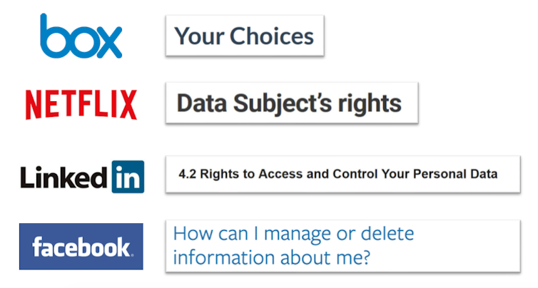
Key terms aren’t standardized across privacy policies on different sites. When we examined privacy policy section headings, we looked for phrases that appeared in multiple policies, such as “your choices” and “opt out.” Unfortunately, we did not find much consistency.
That makes it difficult for users to scan or search for key words or phrases that might help them understand their options. Users would benefit from standardized language across all websites that describes their privacy choices.
Even when a user manages to find a site’s privacy choices, it may not be clear how to use them.
We learned that some opt-out links, instead of leading to an opt-out tool, went to the homepage of an advertising industry association that hosts an opt-out tool, but elsewhere on the site. Other links were broken. Some policies contained multiple links to various advertising opt-outs, but the sites didn’t explain the differences between the links or whether a user would need to visit one or all of them.
One particular website we encountered, Salesforce, linked to six different advertising opt-out tools. In our view, users should not have to parse a website’s complicated third-party relationships; the websites themselves should make it easy for users to opt out of targeted advertising, no matter who is serving it.
Uncertain effects
Once someone does manage to opt-out, it’s not always clear what will happen.
Most websites we visited did not tell users exactly what they could opt out of. Some websites let users request to not be tracked for advertising, while others allow users to opt out of targeted advertising but not the tracking. In this case, a hypothetical shoe ad wouldn’t appear on the site, but the company advertising the shoes may learn that you visited the site.
Only about half of the websites that offered opt-outs for targeted advertising explained whether opting out of seeing targeted ads also meant that users would not be tracked. Users might believe they are protecting themselves from tracking when in fact they are not.
Even when the choices are clear, the pages are not always easy to use.
For example, to opt out of all of Amazon’s email communications, we had to scroll past a list of 79 options before seeing the option to “opt out of all marketing.”
At The New York Times, deleting the data they’d gathered on us required completing 38 different actions, including finding and reading the privacy policy, following the link to the data deletion request form, selecting a request type, selecting up to 22 check boxes, filling in eight form fields, selecting four additional confirmation boxes and completing an “I am not a robot” test.
Even if these design decisions are unintentional, companies are effectively deterring their users from exercising privacy choices.

Consistency is key
When it comes to digital privacy, we think consistency is key.
Websites need to provide choices that are easy to find, understand and use. They should simplify things by offering one-click opt-out options that consolidate multiple links and dozens of options.
It should go without saying that the opt-out links need to actually work.
If websites offer users the ability to make fine-grained choices, it would be helpful to put them all in one place and adopt consistent terminology.
Furthermore, websites need to clarify what opt-out options do.
And perhaps most important, regulators should hold companies accountable not only for offering choices, but for choices that are specific and that consumers can actually use.
[ You’re smart and curious about the world. So are The Conversation’s authors and editors. You can get our highlights each weekend.]
0 Response for the "Website privacy options aren't much of a choice since they're hard to find and use"
Post a Comment